I always knew I wanted to be an architect. Growing up in the mountains of Italy, I was surrounded by my brothers – a bunch of alpha male stonemasons – and I’d work with them mixing cement and carrying block.
They were really macho Italian guys but when the architect showed up, they would all whimp out, drop the act and suddenly become very quiet and respectful. I thought to myself, ‘If an architect can control my wild big brothers like that, I want to be that guy!’
So I went to architectural school and worked for a developer on buildings, then one day a friend asked me to design a gym. I created the first one working out of my basement and it turned out to be very successful. Before I knew it, I had five gym designs going on and never looked back.
It’s worth pointing out that back then, gyms weren’t the architectural icons they are today. My architecture friends would say, ‘Wow, maybe you’ll get some legitimate work soon!’ But over the last 30 years, gym design has become a much bigger business, and I like to think our firm Fabiano Designs (responsible for iconic gym designs for some of the world’s biggest operators) has played a role in pushing this forward.
As you might expect, we’ve learned a lot in this time and the fact remains that great design can really help set your club apart. So here are my top 10 tips for creating a kick-ass club and group exercise environment.

1) Draw inspiration from other sectors
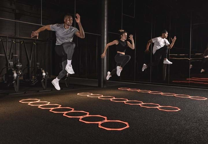
Very few great ideas simply appear out of thin air. Most are inspired by our experiences, so it’s vital to always keep your eyes open for design ideas. Theatre is always a great source of inspiration, as are cultural events, and the trendy boutique clubs have harnessed these particularly well. Think of a nightclub or a concert where people are inspired to get up and dance. That’s a beautiful thing, a spontaneous eruption of movement and joy. I look at that and I think, ‘there is something gyms can learn here’. Group exercise isn’t just a class, it’s a performance, so the studio has to support that performance and elevate it through design and the way it makes members feel.
2) Keep across the key trends shaping fitness design
In an industry as trend-driven as ours, it’s vital to stay on the pulse and this is just as true when it comes to design. In the industry currently, I’d say clubs things are looking for a cleaner and more stripped-down aesthetic. There’s a bit of a Bauhaus ethos at the moment, driven by efficiency, economics, and a desire to strip away the bullshit in the name of authenticity. I think ‘form follows function’ is going to start to be more the rule and style. Great clubs are going to be simpler, more honest in their approach and delivery. That said, coloured lighting – done well, I should add! – is also proving popular and I think this will remain the case for the next 3-4 years at least.
3) Think about the ‘Gram
Instagram has played a big role in helping to bring club design, and fitness in general, to the fore. If you can create a great-looking space to showcase their workout, then members are happy to snap, share on Instagram and rave about it to their friends. Create Instagram-friendly walls that say who your club is and help members to tease out ‘This is where I’m at, I’m having fun, why don’t you join me?’ Get this right and members will become a major cog in your social media machine and will effectively do your marketing for you.
4) Size matters
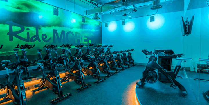
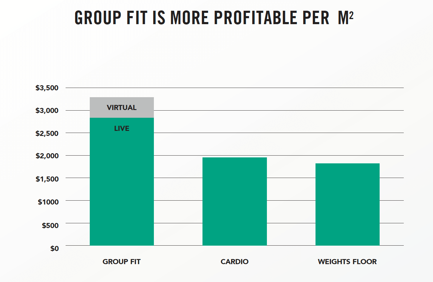
When it comes to designing a great fitness studio, you need to ensure you have enough space for everybody. Too often clubs undersize their studios. Having more people in a group studio is a good thing – it’s smart from an economics perspective (see graphic below) and it builds a buzz. Then it’s about choosing the right lighting, flooring and acoustics to create a sense of theatre. But without a killer sound system and without a rockstar Instructor who knows what they are doing, you can have the best studio in the world and it is not going to move. On a more practical note, storage is another important factor that gets overlooked. Your storage solution needs to look great, optimise the space and make it easy to reach the equipment. We actually like putting the storage by the doors so you can grab your gear on the way in and put it back as you leave.
5) Choreograph the entire member experience
We always live by our guiding principle that when you design, you’re actually choreographing someone’s experience. How do you want people to feel and when? You’re not leaving it up to chance, so you need to consider every detail. What happens when they come into the club space? Where do they see it? When do they see it? What are the proportions of the space? What is the lighting? The flexibility of the space? What do the door handles feel like? So choreography is an important element of club design. But instead of designing workouts, in this case you’re designing emotional cues to help shape their experience.
6) Refurb for a revenue boost
Clubs often view refurbishments as an expensive cost centre, but a smart approach can actually result in a strong revenue uplift, by attracting new members and keeping the ones that you have for longer. We redid a Gainesville Health & Fitness club down in Florida – a very large club – and they used the market research company Medallia to measure key customer metrics. Similar to a Net Promoter Score, they looked at member satisfaction, how likely they are to leave in the next 16 months and how likely they are to refer. The numbers before the renovation averaged around the 6.5 mark out of 10, which is actually pretty good for a club, although some of the numbers were down to 5 in terms of the state of the facility and locker rooms. After we renovated the clubs, the average number shot up to about 9.7, which is an amazing uplift. It really shows the impact of renovating your club and delivering a great product, because the value perception that members have of you goes through the roof and then you’re in a much stronger position to consider price increases without fear of a member backlash.
7) But be sure to budget for it
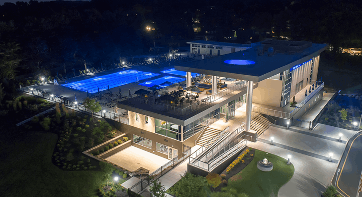
Refurbishments are great for keeping your club vibrant, but you have to budget for them and factor that into planning, which is where I’ve seen a lot of clubs come unstuck. If you look at IHRSA recommendations, they talk about reinvesting in your facility every 3, 5, 7 and 10 years. The 7 and 10 year marks are substantial reinvestments. They talk about reinvesting 20-35% of your annual revenue, which is a substantial amount, but it’s exactly what the best clubs do. If you look at those who are top of the economic food chain in this industry, they’re forever reinvesting in their product, because it ultimately pays off in revenue per square foot and revenue per member. You really can’t afford to cut corners if you’re in this business for the long haul.
8) Avoid the common club design pitfalls
One of the most common questions I hear when it comes to rebranding clubs is “How do I get it to all look alike, to feel like it is part of a home?” My answer is always the same: “Hire a designer; hire someone who knows what they’re doing.” People think they know enough because they have been successful in business, so they don’t need to go to experts for help. That’s one of the biggest mistakes people make, and I’d say moderate success has been the biggest detriment to further growth in this industry. People think if they’re moderately successful then what’s the point in change? The innovators of this industry have always looked forward and said, ‘Yes, I am successful, so how can I be ever more so? How can I stay ahead of the curve?’ So I’ve had the pleasure of working with a lot of truly innovative clients and owners and it has always amazed me that they want to push the envelope further, even though they are already well-established.
The second major pitfall I see is not having a big vision for your club. By this I mean being short-sighted in terms of just looking at the ability to improve just one area through design, forgetting that the member experience is from the front entrance, right through to the back of the house. People will spend a million dollars designing their lobbies, but then ignore the fact that the free weight area lighting is horrible and the acoustics suck in the group ex studio. Not taking the opportunity to look at the club holistically is a big mistake and one you should avoid.
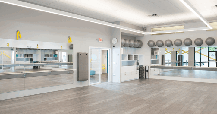
9) Colour is overrated
It might sound strange for a designer to be saying this, but the importance of colour is overrated in the club space. Look at the cover of any major magazine at the newsstand – Cosmo, Vogue or whatever – and you’ll find these colours are incredibly coordinated and bang on trend. But next year is going to be a whole different trend, so picking colours that are going to be infinitely appealing is almost impossible for a club.
The basic palette of the club should be based on the materials that you use, because that’s honest and authentic. You’re using wood, you’re using something on the walls, you’re using coloured glass, you’re using some ceiling motifs – all of that is timeless. Colours are trend-reliant, so overuse of paint is probably one of the worst things you can do in a club. Unless you know what you’re doing, please don’t let primary colours touch! Having red against blue or yellow against blue takes skill and should be approached with caution. The only thing you can do with that is separate it with a nice white and you’ll be much better off.
A lot of low-cost clubs tend to be colourful: this is because it’s less expensive to use colours than it is to use materials. Part of their business plan is to build less expensively, so they have to choose colours and shades that have a longer shelf-life. For this requirement, I look at cars for inspiration. When carmakers choose colours, they know they have to be relevant for the next 10 years for that car to retain a resale value, whereas fashion only lasts about two years.
10) Don’t put style over substance
For all that we’ve spoken about the importance of design to the club member experience, I’m not going to short-change the importance of having a great team and great programming. That’s the heart and soul of the fitness space. Design is the backup that makes all those things look good. We make all those things feel right. We make people feel at ease and comfortable to take that next step in going from a gentle yoga class to a more intense workout like BODYPUMP.
That said, design can have a huge impact on shifting perceptions and changing the way people feel when they’re in a space. I’d argue that Les Mills has always been at the forefront of understanding that programming doesn’t live alone, and that design is critically important to elevate that experience and make it more than just a workout. I was always amazed by how Les Mills was able to build 8,000sq ft studios and make them feel intimate, appropriate and the backdrop for a theatrical performance. Frankly, I learned from those a little bit, but through my designs now, I am trying to give inspiration back.
To find out more about Rudy and to take a tour through some of his finest work, visit: http://www.fabianodesigns.com/

